DysGuise Diagnostics is transforming the way diagnostic reports are written—with smart tools designed for accuracy, efficiency, and alignment with best practice.
Dysguise Diagnostics and its flagship software, DARA, were entering a competitive and technical field where trust, clarity, and compliance are crucial. The existing “Dysguise” identity was well known, so it was important not to lose that recognition — yet the new diagnostics arm needed its own identity that felt authoritative and forward-thinking.
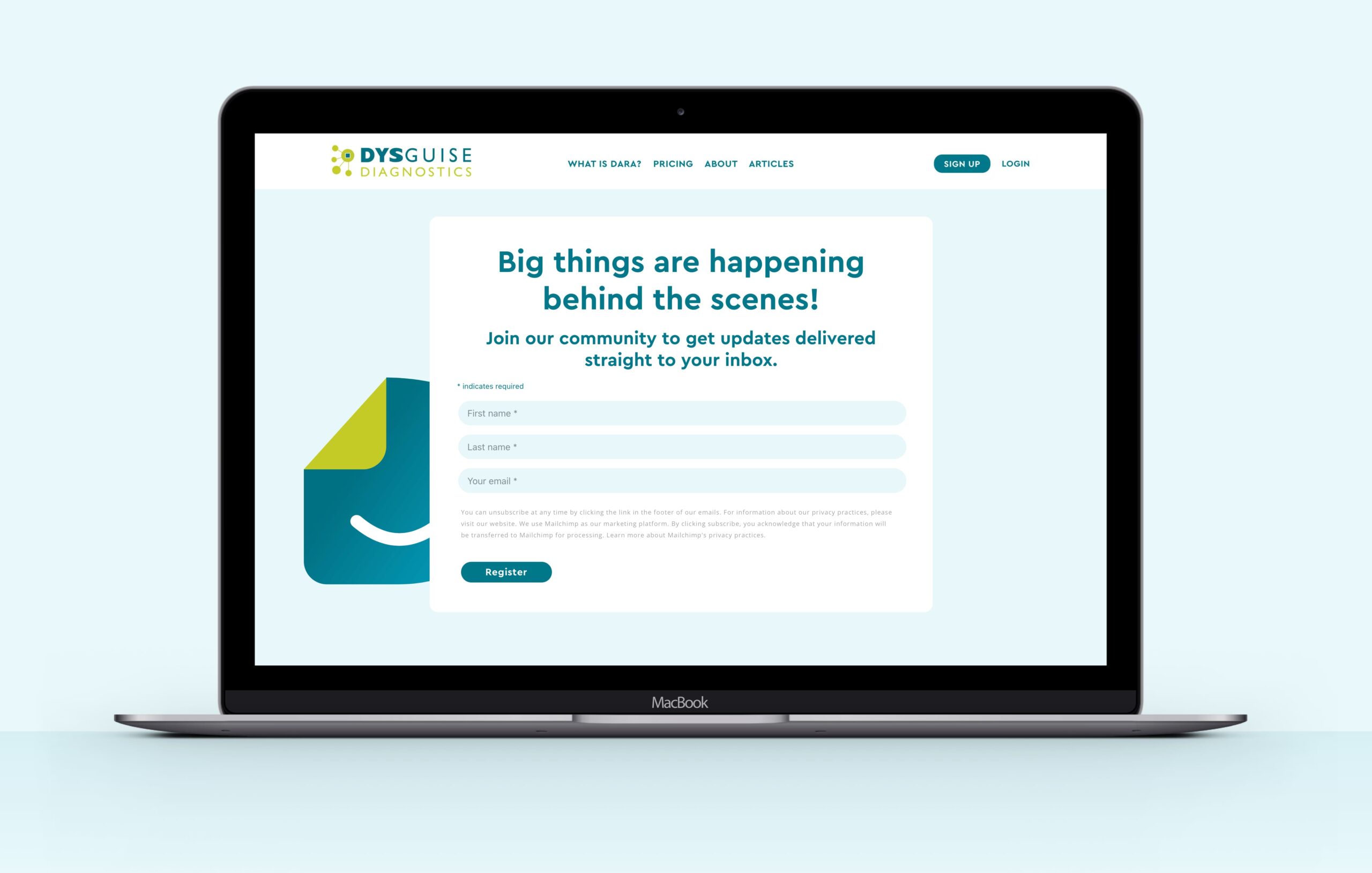
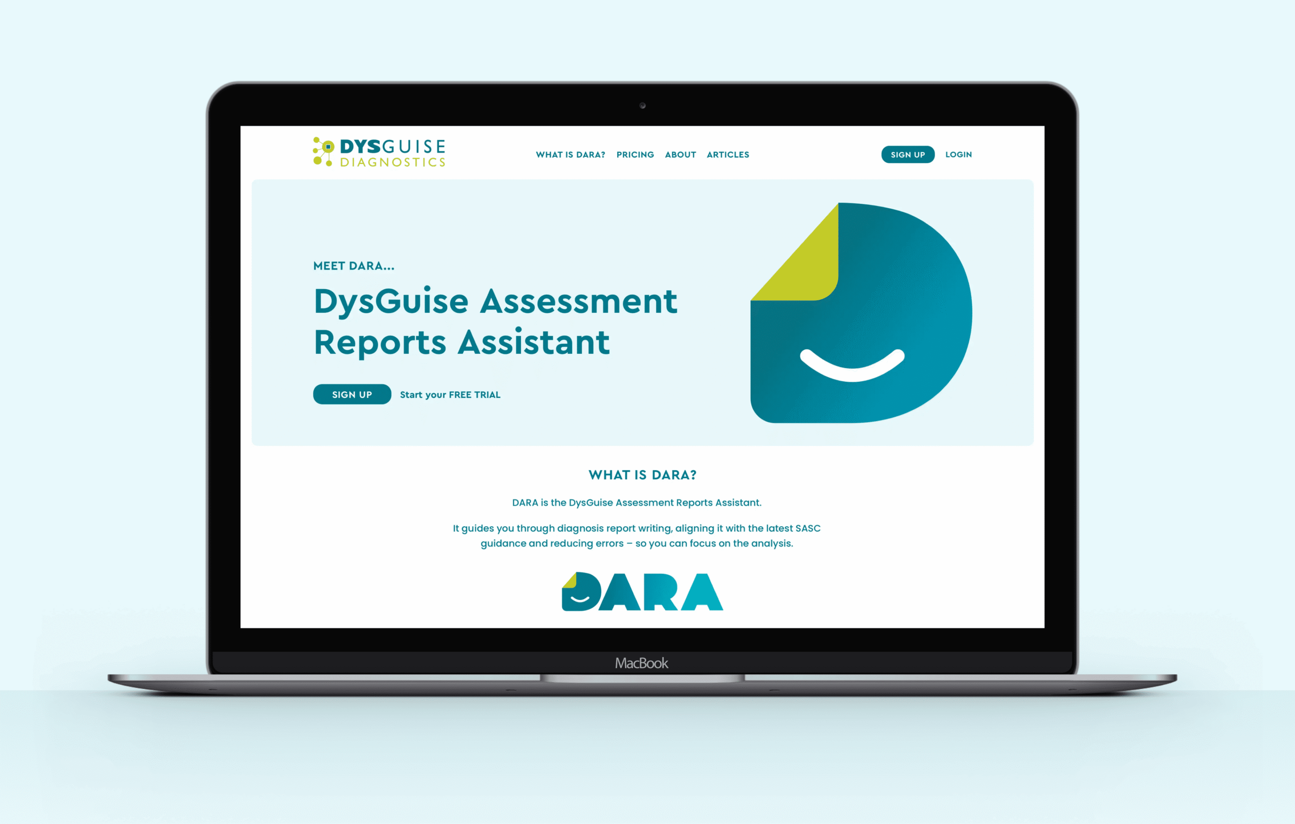
Moreover, the website needed to communicate complex functionality and domain knowledge in a way that was approachable and understandable, not overwhelming. The client wanted the site to feel alive (hence the animations), but it also needed to be clean, professional, and intuitive, especially for users exploring DARA’s capabilities and benefits.
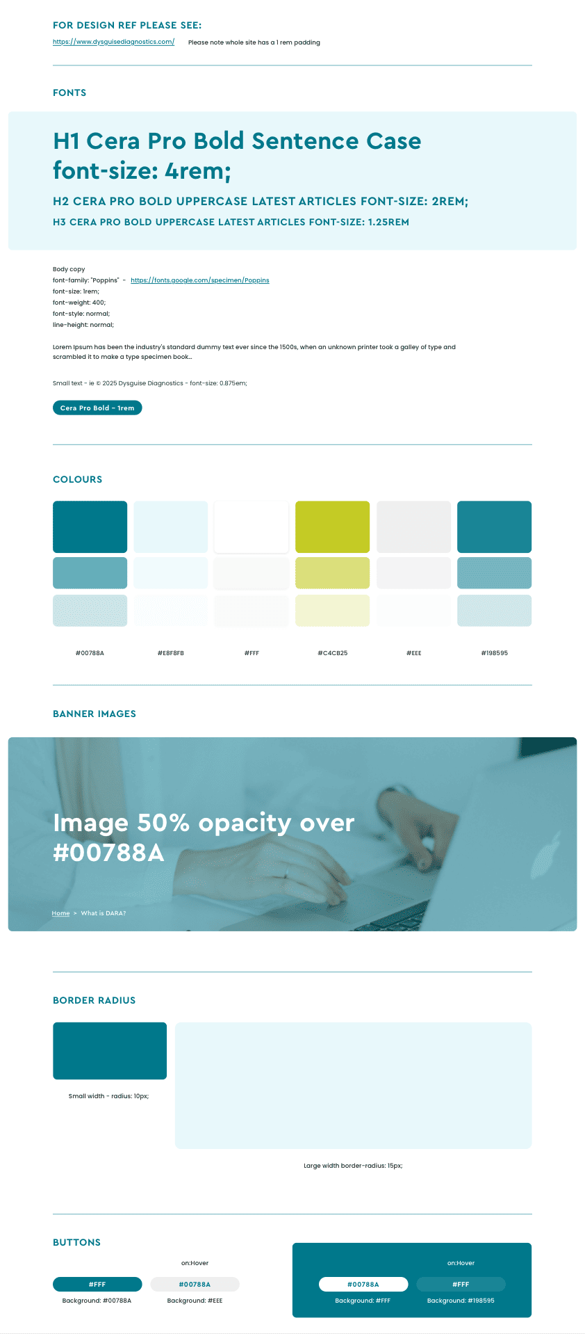
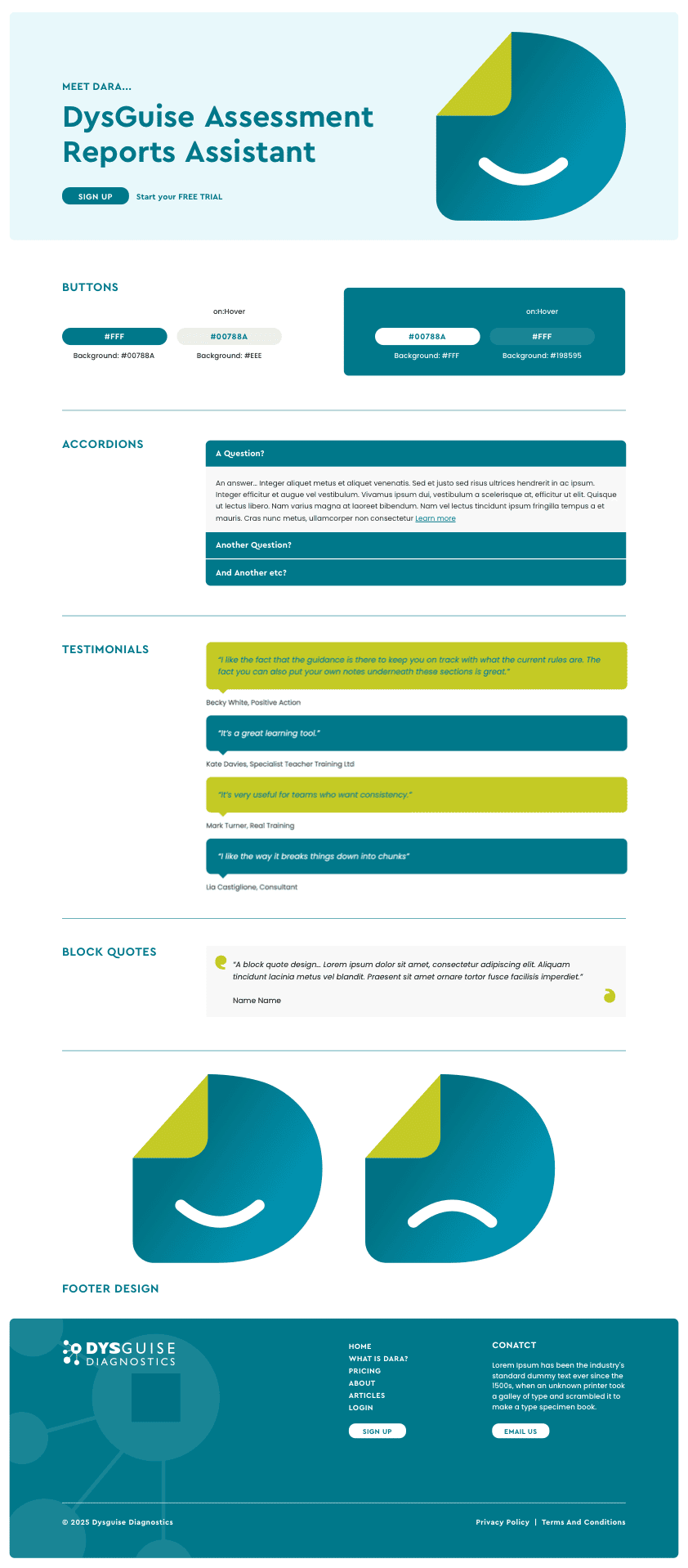
We anchored the redesign by retaining the core “Dysguise” branding and building upon it with a refreshed logo and visual language that signals precision and professionalism. For DARA, we created a complementary identity — a logo and styling that feels part of the same family yet stands out as its own product.
On the website front, we designed and built a site that balances sophistication and clarity. Through purposeful CSS animations, subtle movement, and refined interactions, the site gains visual interest without distracting from the content. Key sections explain how DARA works, show its benefits, and guide users toward registration, all in a structured, intuitive layout.
The combined result is a brand and digital presence that positions Dysguise Diagnostics and DARA as trustworthy, advanced, and user-friendly — perfect for professionals who demand accuracy, efficiency, and compliance in their reporting tools.